
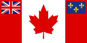
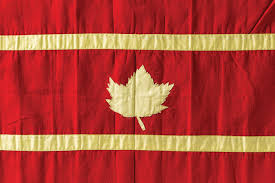
Like other former British Colonies Australia and New Zealand, the original (post 1867) Canadian flag was one left over from colonial days, the ensign. Based on the British naval flag the ensign had a small Union Jack in the top left corner on a blue (in case of Australia and New Zealand) or red (in the case of Canada, Bermuda, Newfoundland and the provinces of Ontario and Manitoba) while the center of the red background would be placed the coat of arms.
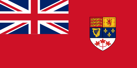
THE RED ENSIGN FLAG
By the mid 20th century many Canadians thought that they had outgrown the colonial flag. At least 30% of the population were French and had never felt a connection to a symbol of British domination in addition there were many immigrant groups, notably the Irish, who felt the same. After two world wars polls showed that even a majority of Anglo-Celtic Canadians felt they had earned their own flag. The Maple Leaf had long been seen as a Canadian symbol since the days of Confederation and had been used on badges and belt buckles in the Canadian military so there was wide acceptance that the leaf could be used in a flag, indeed there were already three Maple Leafs in the coat of arms and thus the flag as it was.
AN 1870's DESIGN WITHOUT THE UNION JACK
In the aftermath of World War Two Liberal Prime Minister William Lyon Mackenzie King seriously considered adapting a new flag which would incorporate the Maple Leaf but faced bitter opposition from the Conservative party. Earlier Liberal governments had toyed with the idea of a new flag (see the above design) but had always backed own in the face of vehement opposition from the Conservative Party. The Tories, largely seen as the party of the Anglo establishment, the Anglican Church and the British Crown had a strong emotional attachment to British and Royal symbols, especially the flag, and denounced any proposed changes as treasonous sell outs to "the French" and immigrants (who tended to vote Liberal). MacKenzie King, always cautious by nature backed down.
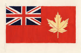
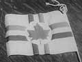
THE 1946 PROPOSED DESIGN
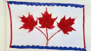
He left office in 1948 and the next Liberal Prime Minister Louis St Laurent was a Quebecois and as such would not have the political backing to take on such an emotional fight against an Anglo symbol even if he thought it was important which he probably did not. He was finally defeated by the Tory John Diefenbaker (a staunch Royalist) in 1957 and St Laurent's successor as Liberal leader was Lester Pearson, a former UN diplomat (and WW1 vet) who made a new flag an election promise. In 1962 he won power and started pushing for a new flag. He had a design in mind; a tri-colour using a white center (representing the Canadian tundra as well as purity) with two blues strips on the border to represent the two oceans and in the center three Maple Leafs, taken from the coat of arms, coloured red to represent the red coats traditionally worn by the Canadian Army and RCMP.
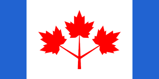
THE PEARSON TRI-COLOUR DESIGN
However in the almost twenty years since MacKenzie King's hesitant attempts Conservative opposition had not let up. Current leader John Diefenbaker was a proud Loyalist as was the party's base in Ontario, British Columbia and the Maritime Provinces along with groups such as the Royal Canadian Legion who predictably painted the new design as "betraying the troops" who had fought under the Red Ensign. Although this argument was somewhat blunted by the fact that as stated the Maple Leaf had always been used as a Canadian military symbol. Besides Diefenbaker's no doubt sincere devotion to the Union Jack and the Crown he also saw the flag as being an election issue that he could demagogue his way back in to power, so Pearson (who only had a minority government) was going to be facing a tough fight. Unlike King however Pearson would not back down, however even though Pearson had his own design he was too smart a diplomat to insist on it, especially if it got in the way of the prime goal, a new flag. So while still pushing for his favoured design he also involved the public by announcing a design competition which thousands of Canadians joined in on with designs ranging from the sober and thoughtful to the wildly creative to the downright silly.
Here are some of the standouts in no particular order;

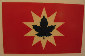
This came from a group called the Native Sons Of Canada who were a conservative, but French group who had actually been pushing for a new design since at least the end of WW2. The red and white symbolize the English (red as the colour of the red coats) and French (white was the colour of the French royal flag) while the red also stood for the blood of patriots and the white for purity and the Canadian tundra. It's not bad, it's a clean design, easy to replicate and it still works if shrunken down. But the lack of borders misses the sea-to-sea theme and the red-on-red doesn't really work from a distance.
This was an earlier effort from the Native Sons and it's more traditional, too traditional really. Don't know the colour scheme but I'm guessing red, white & blue, although there's room for more colours here.

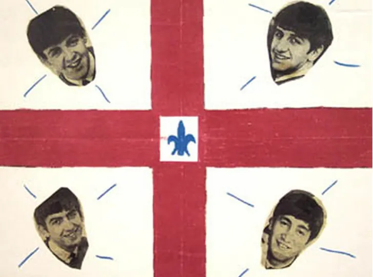
Even though Pearson had made it clear that it was time to move away from the Union Jack and Fleur De Lys some people clearly didn't get the memo. Also this is way too busy
This one either took the above design and simplified it or the above design is a more complicated version of this. Still misses the sea-to-sea theme.
Speaking of people who didn't get the memo and busy designs, this one takes an existing perfectly good design (more on that below) and makes it way more complicated.
This one takes the American idea of using a Maple Leaf to represent each province, and it looks too...American.
This one simply takes Pearson's design and moves the blue borders, which were supposed to symbolize the two oceans, and turns them into a top-&-bottom frame which symbolizes...nothing.
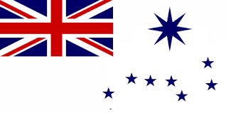
This one obviously works with the flags for fellow Commonwealth countries Australia and New Zealand while changing the blue background with white to represent the Canadian tundra and the big dipper and North Star on the white field. Attractive enough but too derivative and it's still an ensign.
This person went through the effort to make an actual flag but it just looks like a sports logo from 1900.
I believe the arms is taken from a naval arms but this looks like a flag from a mid-sized city. Not a nation.
Red, White & Black? At least the Goths of Canada now have a flag.
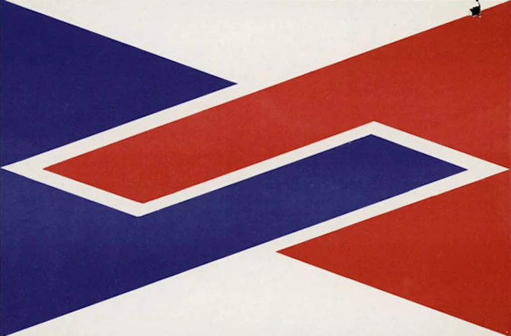
Now we're getting some modern designs (it was the 1960's after all) and this is certainly modern. The theme here is English (red) linking up with French (blue) on a white ground representing the tundra. It's a striking design and conceptually this is workable but it's far too modern to ever have a chance. There are Caribbean and African flags that sort of look like this though.
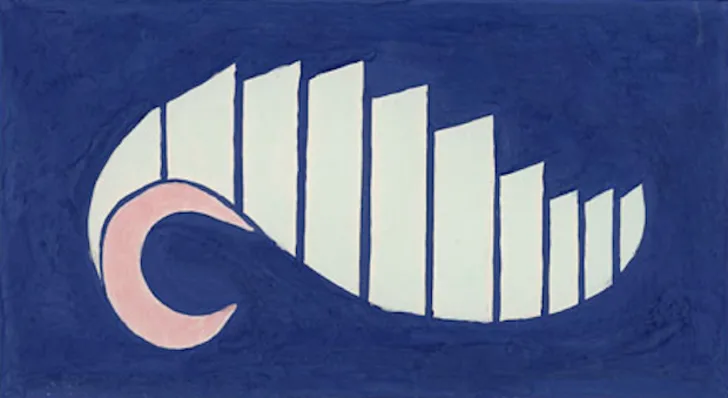
This one has ten towers (or grain silos?) representing each province rushing to the future led by a "C" for Canada surrounded by a blue ocean. Manages to be both creative and bland and looks more like the logo for an insurance company.
This is just lazy and absurdly literal. Also looks like a gas station logo.
I assume this incorporates some Native artwork but all I see are googly eyes and now so will you.
This one probably also incorporates some vague notion of Native art (specifically Inuit) but the sixties was also when Toronto and other cities were putting sculptures by Henry Moore in front of City Hall and this also looks like that along with linear abstract art. Don't know why it's in B&W though. Unless that's a really dark blue.
Speaking of the Sixties. There's always a few jokers in the pack.
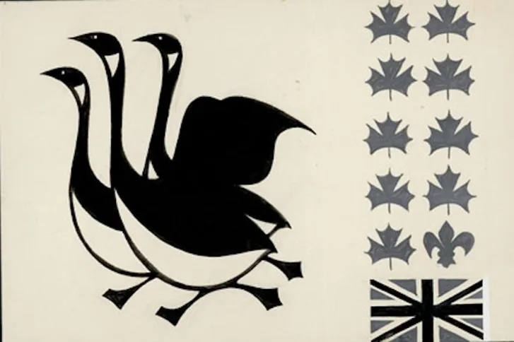
This one has some cute Micheal Snow style Canada Geese with nine leafs for each province and a fleur de lys for Quebec and a Union Jack. If they were to just drop all that business and just moved the geese to the right and put a single red leaf in the top left this would actually make a cool flag for some Ontario Muskoka town.

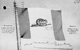
And we're back with the rank amateurs again. This one takes three other designs and slaps a beaver on it. A little surprised we didn't see more beavers actually.
There we go, that's more like it.

A amateur effort using a Scottish St Andrews cross (although the colour scheme is wrong) using the red & white of the Union Jack (but oddly not the blue) with the three gold Leafs from the Coat Of Arms. Conceptually a workable design and maybe suitable for a yacht.
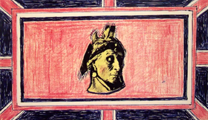
This one just adds a red field on top of a Union Jack then adds a Native head on it. The artist included a helpful note saying that if the committee wanted they could just switch out the head for a Maple Leaf. Either way it's ugly.
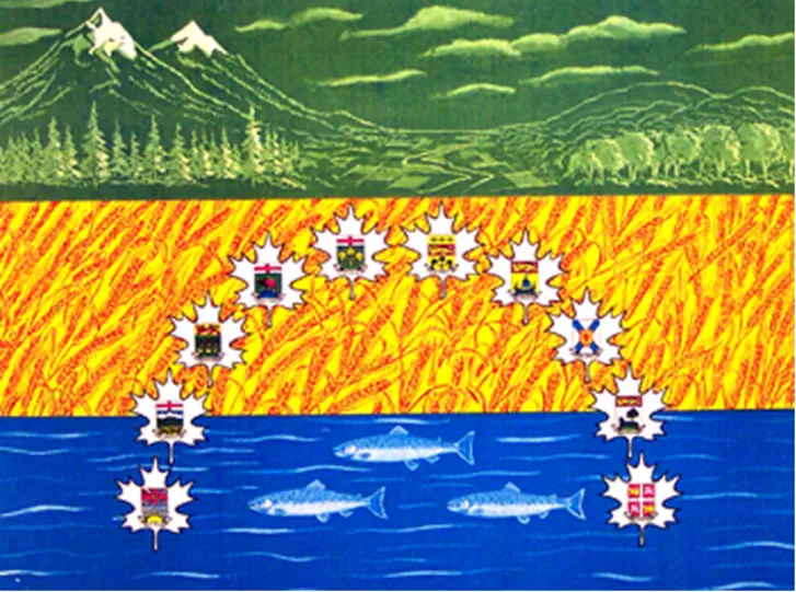
I take back everything I said about other designs being too busy, this one has everything; mountains, forests, wheat fields, oceans, fish, Maple Leafs, provincial coats of arms and an entire box of pencil crayons. At first I assumed this was from a school project but the amount of detail in this has to be from a trained illustrator. Albeit a delusional one.

This one actually was from a seven year old girl and while the committee obviously didn't consider it they did forward it to the National Archives so that's nice.
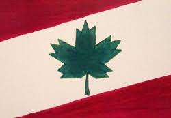
In the end even though many of the designs may have been frivolous the contest was probably most helpful to Pearson's cause as it invited everyday Canadians into the process and got them used to the idea that the flag could indeed be changed. Eventually the designs got whittled down to a few finalists which included the existing Red Ensign, Pearson's triple Red Leaf tri-colour and a new tri-colour design made by historian George Stanley that also took Pearson's Maple Leaf design and slightly simplified it by using a single leaf and changing the thin blue borders to broader red ones.
THE STANLEY DESIGN
By September 1964 these designs were forwarded to a Parliamentary Committee to be voted on. That's when the politicians really got involved. Diefenbaker and older Tories remained bitterly opposed to any compromise but some of the younger Tories were starting to get concerned that the parties uncompromising stance and some of the anti-French and anti-immigrant rhetoric was going to hurt them in urban and Francophone areas. There were also three other parties to consider. The CCF (forerunner to the NDP) was supportive of a new flag with a Maple Leaf but not eager to give Pearson a complete victory by endorsing his favoured design. Then there was the other party, the now extinct Social Credit Party. The So Creds were a uniquely Canadian party difficult to classify ideologically. Based in Alberta and parts of Western Canada they were essentially a socially conservative populist party but they were also suspicious of the Conservative establishment (the So Creds also always attracted conspiracy theorists including those hostile to the Royal Family) and much of their support came from non-Anglo (albeit still white) voters. The So Creds were also divided into different and often feuding wings in English and French Canada, neither of whom were interested in fighting to the last for a symbol of the British Crown. Accordingly the Parliamentary Committee was made up of fifteen members broken down as seven Liberals, five Tories, one CCF and two So Creds (both from Quebec who probably backed the Native Sons design).
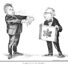
DIEFENBAKER, PEARSON AND CCF LEADER TOMMY DOUGLAS HAVING A REASONED DEBATE ABOUT THE FLAG
When it finally came time to vote on designs they had narrowed it down to three. The first option was to keep the existing Red Ensign, which all the Tories promptly voted for with all other voting against.The next option was Stanley's Red Maple Leaf and now the horsetrading began. The shrewd Pearson decided to pull away from the design he had been pushing and instead accept the Red Leaf design the CCF favoured and So Cred MP's followed suit. The Liberals had in fact met secretly with the CCF and So Creds and agreed to accept the Red Leaf. They did not however invite the Tories to these meetings. Meanwhile the Tories had come up with a plan to embarrass the Liberals. Thinking the Liberals were still committed to the Pearson design they decided to vote for for the Stanley design, assuming the NDP and So Creds would do the same and the Liberals would then be isolated and would be forced to try and ram their design through Parliament which could force an election with the flag as an issue. So when the option of the Red Leaf came up the Tories voted yes along with the CCF and So Creds as expected then to their horror saw the Liberals do the same to make the vote unanimous making the Pearson design superfluous and moving the vote to Parliament. In vain the Tories tried to force a committee vote to say the previous vote was non binding but the other parties voted it down, probably while stifling a giggle. By the time the vote made it's way to Parliament Diefenbaker was furious at being out-foxed by Pearson (who he loathed) and hoped to filibuster the bill but the Liberals and CCF controlled enough votes to stop that and by that point several Tory MP's had had enough of Diefenbaker's antics and voted with the government as well, much to his fury. Diefenbaker was so blindingly angry in fact that when Pearson, showing some class, offered to give some of his speaking time to Diefenbaker he bitterly turned it down. The final vote the new flag passed easily and at the flag raising ceremony, where Diefenbaker attended but again refused to speak, he wiped tears from his eyes and later claimed that the new flag (which he called "insipid") would never be accepted by Canadians.
DIEFENBAKER & PEARSON
This prediction turned out to be untrue of course. In a remarkably short period of time the new flag was accepted and was given pride of place at the massive year-long Canadian Centennial celebrations in 1967. Today the Canadian Red Maple Leaf is consistently being rated one of the most recognizable and popular flags international and beloved at home. Even the Tory Party quickly reconciled themselves (especially after Diefenbaker was deposed as Tory leader) and the flag was not even an issue in the 1968 election. However the partisan battle for the flag explains why Flag Day never became a holiday in Canada. Even if the bitter partisan battle and rhetoric over the flag have been largely forgotten, it would have been seen as gloating for the Liberals to have made Flag Day a holiday and Lester Pearson was far too shrewd and diplomatic to cheapen things by doing something that crass. When Diefenbaker died in 1979 he was buried not with the Maple Leaf but with the Red Ensign.

In the last decade there has been an attempt by some on the far right to attack the Maple Leaf flag. Starting with the Proud Boys other white nationalist and anti-immigrant groups have started flying the Red Ensign to symbolize the white, Anglo Canada they want to "Make Great Again', while supporters of Wexit (mostly in Alberta and Saskatchewan) refuse to recognize Canada at all and have designed their own flags. If Diefenbaker were alive today I seriously doubt he would be happy to have his beloved Red Ensign sullied by racists, fascists and separatist conspiracy theorists. While Diefenbaker may have been a bitter old crank who hated the Liberals and NDP he proudly supported immigration and was definitely no fascist. And he was a proud Canadian who would have had little time for Wexit grifters. He might have even mellowed on the flag by now.
No comments:
Post a Comment